
In the Customer Dashboards, metrics, indicators, graphs, and performance analysis of sales results will be presented.
When accessing the dashboard, you view, by default, the results of the last 28 days (4 exact weeks). If desired, you can analyze other periods by applying a filter.
On this page:
-
Indicators
-
Customer Lifetime Value Evolution
-
Average Ticket per Customer
-
Customers
-
Origins
-
Payment Methods
Indicators
In the Indicators section, you can observe the main indicators, such as:
-
Total Customers: displays all customers in the account, i.e., who made at least one purchase - if you want to find the information apply the filter type "customer" in the contacts tab;
-
Active Customers: displays all customers who made a purchase in the period applied in the filter - will always be the sum of new + old customers;
-
New Customers: displays the quantity of current customers, how many are new, i.e., who bought from you for the first time;
-
Old Customers: displays the quantity of current customers, how many are buying from you for the second time or more.

By default, the presented results consider customers from the last 28 days. In case of filter alteration, only customers who meet the filtering criteria are considered.
Customer Lifetime Value Evolution
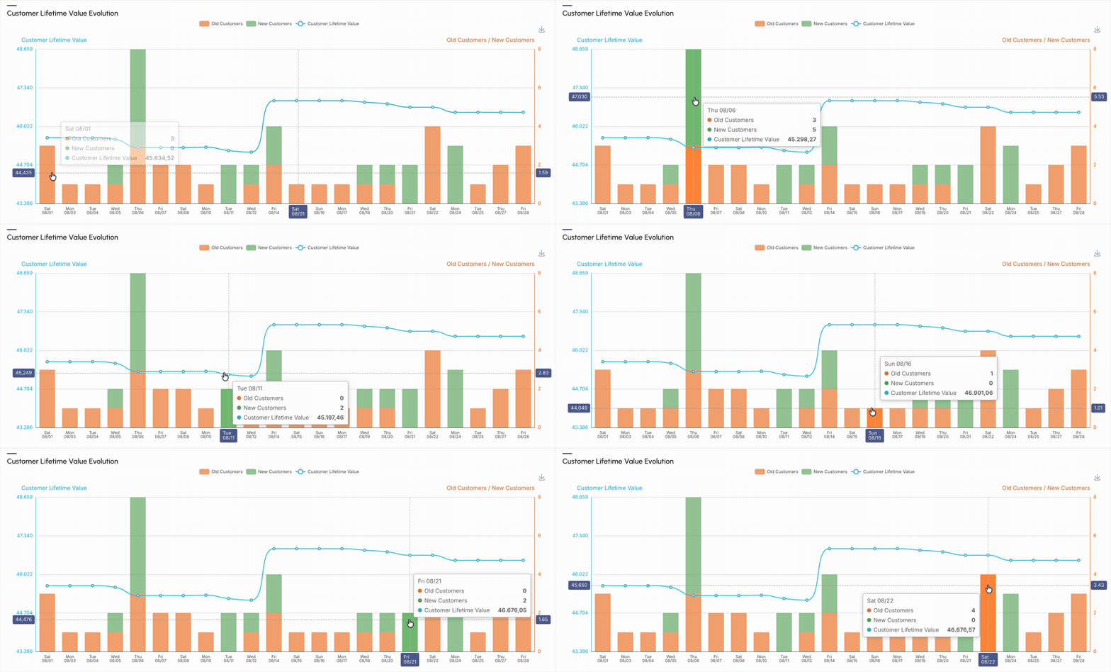
In the section Customer Lifetime Value Evolution, the graph represents an evolution of Customer Lifetime Value, that is, what is the average revenue generated by each customer within your business, relating the number of customer lifetime value, old customers, new customers.
Graph
The graph displays the variation of customers in terms of the quantity of old customers and new customers in the period, which can be daily (for periods up to 31 days) or monthly (for periods over 31 days).
Performance indicators
-
Old Customers: displays the quantity of old customers who generated revenue in the indicated period;
-
New Customers: displays the quantity of new customers who generated revenue in the indicated period;
-
Customer Lifetime Value: displays how much revenue each customer generates for you in the indicated period.
Guru's Tip:
If desired, you can save the graph image: 
Customer Average Ticket
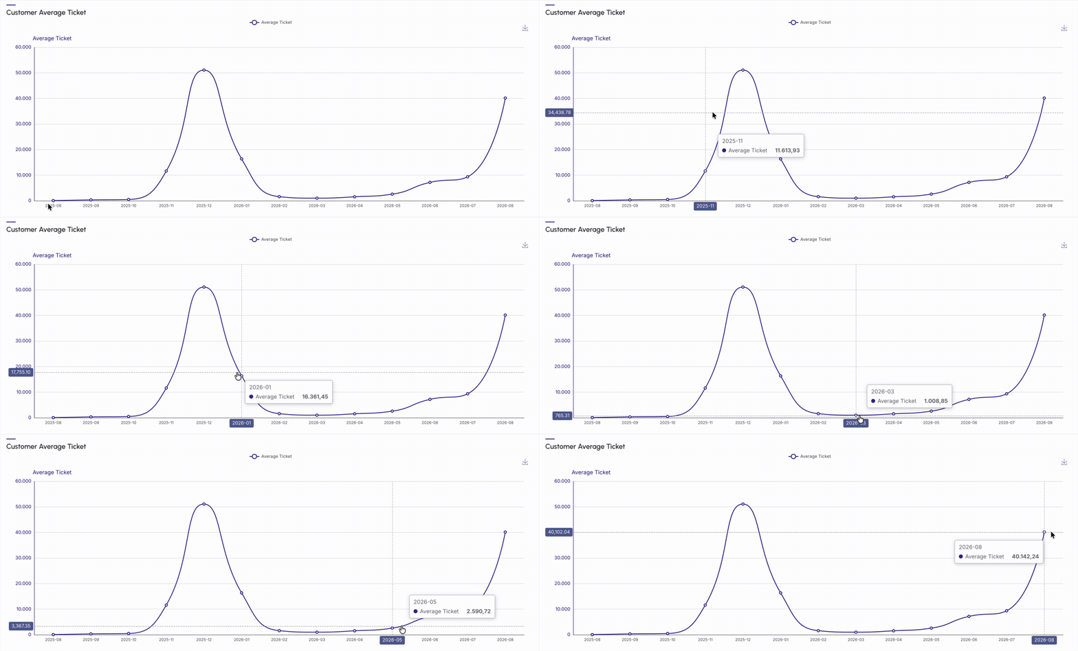
In the section Customer Average Ticket, the graph represents the Customer Average Ticket, that is, the average value that this customer buys within your business in the indicated period.
Guru's Tip:
If desired, you can save the graph image:
Customers
In the section Customers it is possible to consult the Customer Lifetime Value, the average sales for each customer, and the average ticket they generate, that is, buy from you within your business.
-
Customer Lifetime Value: displays how much revenue each customer generates for you;
-
Sales per Customers: how many sales, on average, are made to each customer in the period;
-
Average Ticket: the average value that this customer buys in the period.

Guru's Tip:
You can consult the percentage of each status by clicking on the title.
Origins
In the section Origins it is possible to consult the origin of old and active customers, grouped by traffic source, informed in the tracking link, when the P.P.C.T.s.are created.
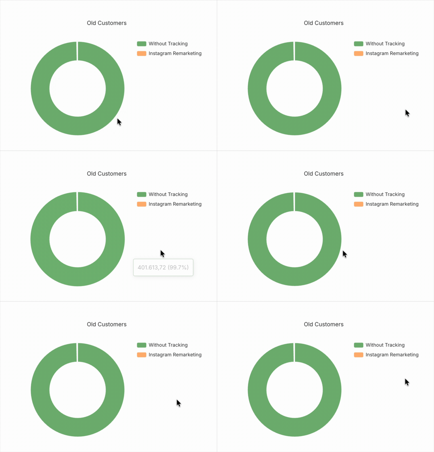
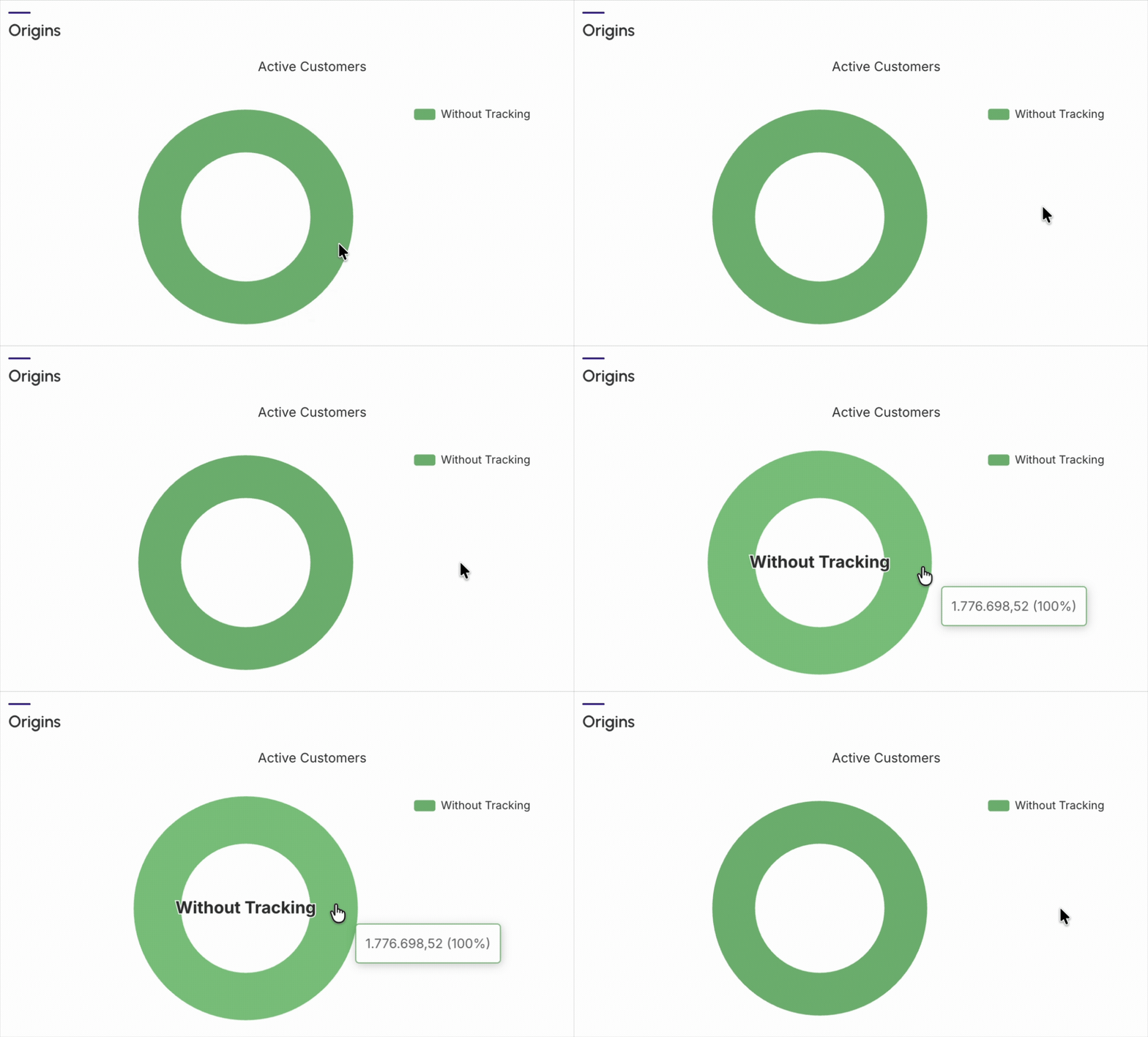
By default, the presented results consider customers from the last 28 days. In case of filter alteration, only customers who meet the filtering criteria are considered.
Guru's Tip:
You can consult the percentage of each status by clicking on the title.
Payment Methods
In the section Payment Methods, the graph represents the origin of active and old customers, which can be untracked or tracked traffic (like Facebook, for example). Remember that the traffic origin will be informed if the tracking link is created through the P.P.C.T..
The data from this graph can be used to boost your results. For example:
-
Use the data from this graph to find out which payment type is most used by your customers and create strategies to increase conversion for each of them. For example, if you have a high number of sales;
-
By bank slip, this percentage may indicate that your customer is undecided about the purchase or your sales page did not provide enough security. In this case, you can choose to invest in strategies for recovering the bank slip (via SMS or email sequence – taking advantage of the integration with your autoresponder).
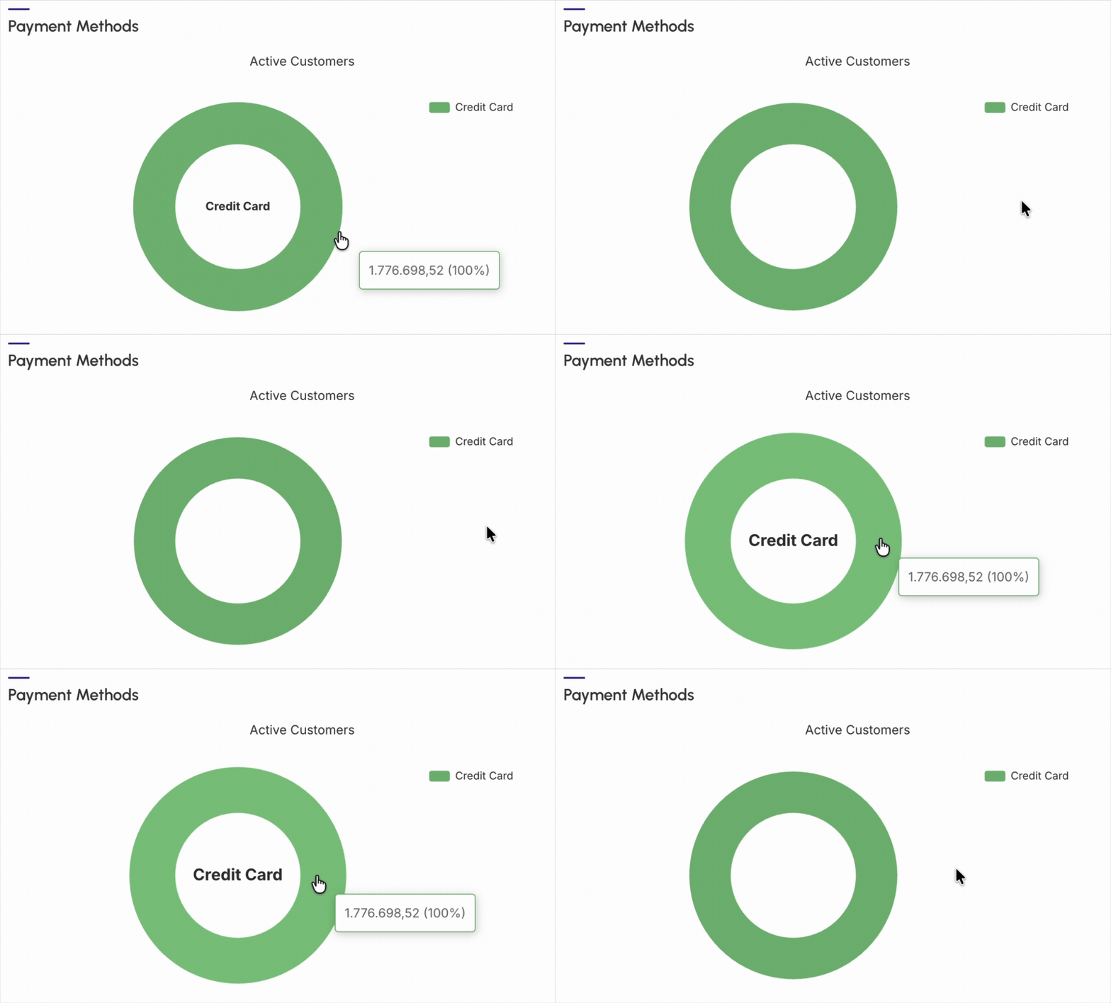
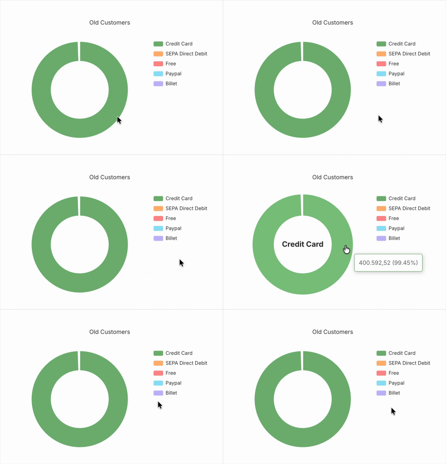
By default, the presented results consider customers from the last 28 days. In case of filter alteration, only customers who meet the filtering criteria are considered.
Guru's Tip:
You can consult the percentage of each status by clicking on the title.